You saw it here first.. scamp of how our MVP2 could look
No doubt regular readers of this blog are quickly getting sick of reading about agile, iterative and rapid prototyping, but this will keep coming… sorry about that.
Our second minimal viable product (MVP) is all about user support – not just supporting users to order, complete and return STI test kits, but support, advice and information about anything to do with sexual health, including contraception.
This represents a pivotal change in our service – it sees us move towards our vision of a holistic sexual health service. It’s also the precursor to contraception services being added during our next MVP.
In essence, MVP#2 attempts to answer three [truly] epic questions:
- How do we offer information and support on all aspects of sexual health?
- How do we increase the return rate of STI kits?
- How do we serve users under 16 years old (in essence how we make the SH:24 really accessible to all)?
Info & support
Continuing with our iterative and agile approach, after some rich consultations with people in our partner clinics, we added two basic support services to the site to test appetite; text back and call back, allowing users to contact us about anything sexual health.
Since going live back in June, we have averaged about 7 text back requests and 2 call back requests per week – not huge numbers, but with no marketing or promotion, we were encouraged by the take up. When we receive a clinical question or a call back request we refer to a clinician at one of our partner clinics.
In July we added ghost links to the site for a web chat service – this too has proved popular, with the link being hit at least 3 times a day on average. We plan to add a similar ghost link for traditional telephone support.
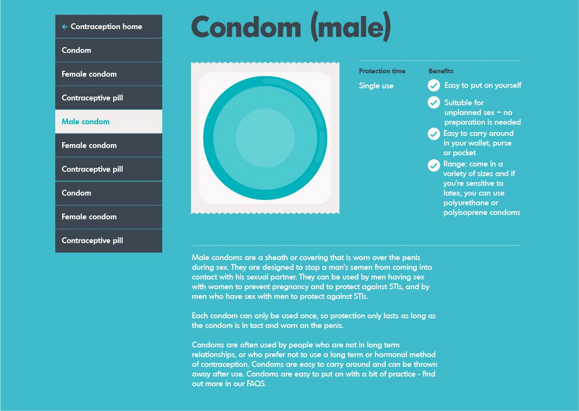
By far the biggest challenge for MVP#2 is balance. At the moment, the service is effectively a channel to order an STI test kit alone. By adding more content (on contraception, genital health, more STIs, fertility and pregnancy) and offering more support mechanisms, the balance of the site could easily become confused. This is particularly true when talking about the contraception content – which can only be described as considerably heavy stuff.
Communicating contraceptive choice

Never before did I appreciate just how many forms of contraception there are – no less than fifteen (in common use). How we communicate this information is a challenge - how we crunch, articulate and present data. Success lies in hitting on the right UI and the right content (scale, priority and tone of voice).
There are countless websites in the UK and beyond which carry this content already, posing the question why are we bothering to regurgitate it?
Having benchmarked a lot of them (and there are a lot), it’s a pretty simple answer; most are too fat, difficult to read and/or navigate (particularly on a small screen), and do not contain the information the information users most need and want (or if they do, it’s in the right order).
We came to this conclusion by talking to users and clinicians. This helped us to understand;
- what info and support people want
- why people want it
- how they want to access it
- when they want to access it
Removing the obvious, adding the meaningful
So Mollie and I started to wireframe… with some interesting results. We kept asking ourselves, how can we make information usable, accessible and desirable through subtracting and hiding, and; how do we remove the obvious and add the meaningful (if that’s possible)?
Several paper based iterations later, and again testing our thinking with real users (face to face and online), our developers started to build some rudimentary digital prototypes.
Our key user insights are as follows:
- users want clear and simple vs. interactive features
- users clearly had a priority order in which they wanted to consume info
- users want easy to understand visual language vs. endless copy
- users want the STI testing element of the service to remain and to be integrated into supplementary sections
- in order to have faith in content, users want to know that it is up to date and has been approved by a senior clinician (not a copy editor)
- users told us that getting the tone of voice right was essential (non-judgmental, factual but human)
- users wanted webchat, but still valued the convenience of text messaging
Prioritising information; balancing user wants with what needs to be communicated
One of our most interesting insights was around the order and priority of content, i.e. what do people want to know, and know first? We were surprised at just how consistent these views were on contraception devices, particularly amongst female users. Here are a few examples; the trend (up or down) and popularity of the contraceptive method, who’s taking it (age/situation), how long it lasts (term), what impact it has on your period, and how far it delays conception. Interestingly, you’d struggle to find this information in the top half of most existing webpages. Even more interesting, is how some of our clinical team members reacted when we shared these particular insights with them – quite rightfully, they had some reservations.
As ever we continue to iterate – watch this space.